First, thank you for all your work on this, Luke. This has been invaluable to me! As a bass player I use the app mainly as a “fake book” on gigs/picks to make sure I’m always laying down the right chords for everyone else. To that end, there are a couple of things I wish the app had already.
First, the ability to insert text in a tune. I saw there was another request to insert images, ala tabs, but my thinking is that text would be sufficient to indicate when the bass would walk up/down (without writing in the actual notes), or for a vocal cue.
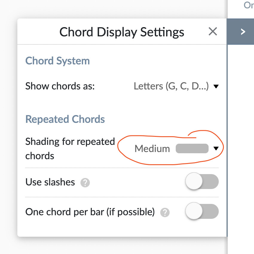
Next is having the first chord of every line in bold. When the chord is repeated from the previous line (measure), by default the font is a lighter color. I see where I could make every chord appear as bold/dark, but I’m trying to split the difference.
Lastly, and probably most difficult, would be the ability to zoom out so that more of the tune fits into the screen. Some tunes are long and I can’t take a hand off my bass to scroll! Perhaps a more reasonable option is to be able to shrink everything for the same effect but not changing the actual screen?