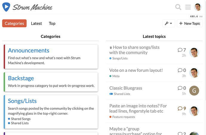
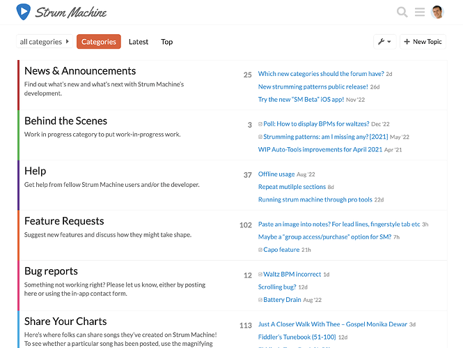
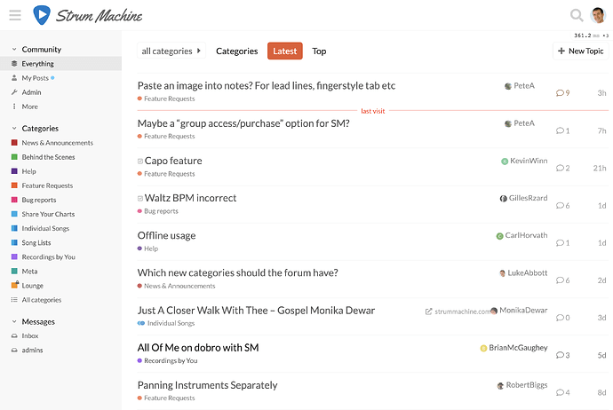
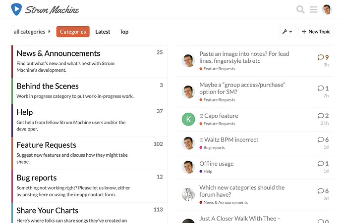
The default layout of the forum currently shows the categories and latest posts side by side. I picked it initially because it seemed like a good way to both show the categories (i.e. the topics the forum covers) as well as the latest posts. But it’s also pretty “busy” to the eye, and I’m not sure if it’s the best layout anymore, especially since the new version of Discourse (the forum platform) includes a new option (#3 below) to choose from.
Here are the various options available to me. I wonder if any of these strike you or anyone else reading this as preferable? (UPDATE: I just changed the default design (#1) a bit.)
1. Categories and latest posts side by side (recently updated):
Luke’s opinion: (+) easy to see latest posts, (+) shows a list of categories along with descriptions, (–) kind of busy (though perhaps improved from before), (–) posts from all categories mixed together.
2. Categories with latest posts in each topic:
Luke’s opinion: (+) puts more attention on the categories, (+) probably more welcoming to a new user, (+) easy to see activity on a category-by-category basis, (–) not immediately apparent what the latest discussions are, (–) no user names or avatars, makes it feel more impersonal?
(Live example: Obsidian forums)
3. Latest topics with categories in sidebar:
Luke’s opinion: (+) latest posts are front and center, (+) categories are clearly visible, albeit (–) no category descriptions shown… also, (~) personal novelty bias as the forum software just added the option this month.
(Live example: Hookmark forums)
Shall we put it to a vote?
I don’t think I’ve ever done a poll here… let’s try this out!
- 1. Categories and latest posts side by side (current setting)
- 2. Categories along with latest posts in each category
- 3. Latest topics with categories in sidebar
0 voters


